The real problem is that you don't own the page
Advice about standing out on Etsy usually starts with your banner and your shop announcement. Those matter a little. But it is worth being clear about the structural situation first, because it explains why so much of that advice underdelivers.
Your Etsy shop is a template. The layout is Etsy's, the fonts are Etsy's, the navigation is Etsy's, and the recommendation strip at the bottom of your listing is Etsy showing your competitors to your visitor. You cannot change any of it. Two shops selling entirely different work, at entirely different price points, appear to a first-time buyer as near-identical grids of square thumbnails.
This is not a flaw. Etsy is a marketplace, and consistency is what makes a marketplace work for buyers. But it does mean the usual levers of differentiation, design and presentation, are mostly unavailable to you.
What you can still control inside Etsy
Start here, because these are free and they compound.
Your first photo, far more than the rest
In search results your listing is one square image and a price. That single image does almost all of the work of getting a click. Shoot on a clean, consistent background, fill the frame with the product, and make sure it is legible at thumbnail size. A photo that looks lovely at full size and muddy at 200 pixels is losing you the click before anyone reads a word.
Consistency across your first photos also creates the one visual signature Etsy cannot take from you. When someone lands on your shop and every thumbnail shares a background and a light, it reads as a brand rather than a pile of listings.
Titles and tags written the way buyers search
Put the words a buyer would actually type at the front of your title, not your own poetic product name. Use all 13 tags, favour multi-word phrases over single words, and do not waste tags repeating words already in your title.
A shop that is obviously run by a person
Your About section, process photos, and a specific shop announcement do more than they look like they do, because they are among the few places on Etsy where your voice survives the template. Buyers on Etsy are explicitly looking for the opposite of anonymous. Give them something to attach to.
Reviews, treated as the asset they are
Your star rating and review count follow you everywhere on Etsy and are the strongest social proof you have. Everything that protects them, accurate descriptions, honest dimensions, careful packing, fast replies, is also marketing.
The hard limits nobody tells you about upfront
There is a category of thing you simply cannot do on Etsy, and it is worth knowing where the wall is so you stop pushing on it.
- You cannot install apps or scripts on your Etsy shop. There is no theme, no code, and no plugin ecosystem.
- You cannot run your own Meta Pixel or Google Analytics on your Etsy pages, so you cannot build retargeting audiences from people who browsed your work and left.
- You cannot see who your visitors are beyond the aggregate stats Etsy chooses to show you.
- You cannot change the layout, and you cannot remove the competitor recommendations Etsy places under your listings.
- You do not own the customer relationship. Etsy does, and its terms limit how you can move buyers off-platform.
That second point is the expensive one. If you pay for ads to bring people to your Etsy listings, you are paying to send traffic to a page where you cannot retarget the ones who did not buy. For most sellers that is the single largest hidden cost of selling on Etsy, and it is invisible because it never shows up as a line item.
The fix: one page you actually control
The way around a template you cannot change is not to fight it. It is to have somewhere else to send people, and to keep Etsy doing the part it does well, which is checkout, payments, and buyer trust.
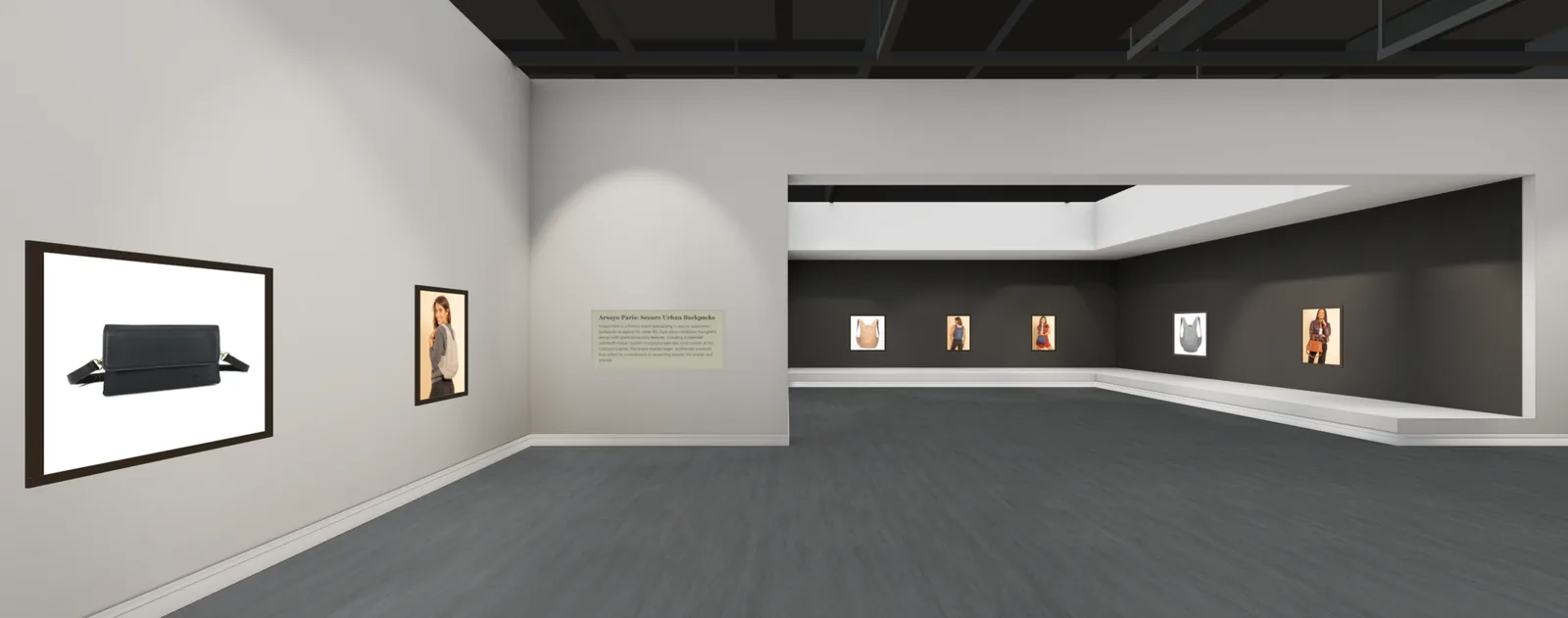
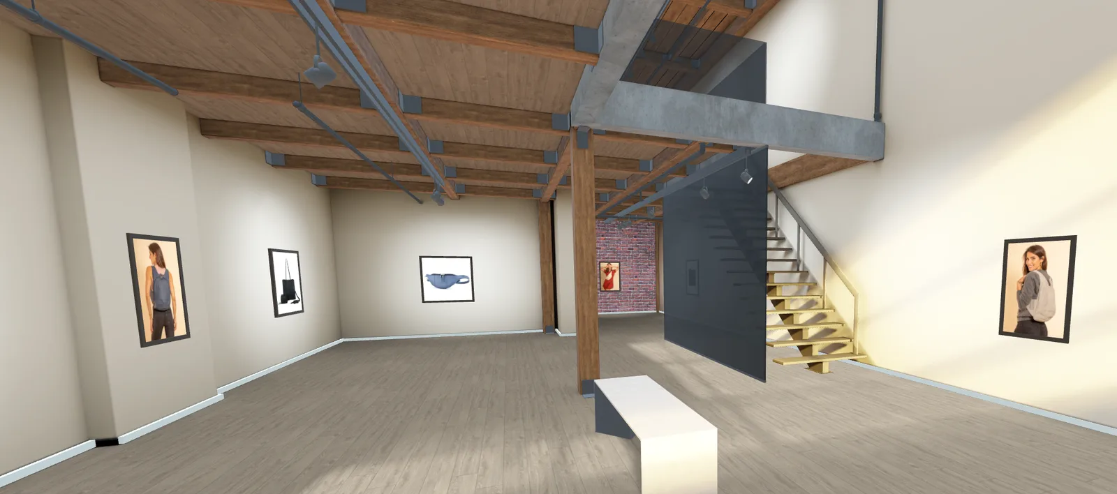
A virtual showroom is one way to do that. It is a 3D room holding your work, opened from a single link in any browser, on a phone or a laptop or in a VR headset. Visitors walk through it, stop in front of a piece, read about it, and tap through to your Etsy listing to buy. Etsy keeps the checkout, the buyer protection, and the reviews. You get a page that looks like you.
Why this specifically helps an Etsy seller
- It is a link, not an app. Since you cannot install anything on Etsy, anything that requires installation is unavailable to you by definition. A standalone gallery sidesteps that entirely.
- Your own tracking finally works. A gallery is a page you control, so you can run your own Meta Pixel and Google Analytics on it and build the retargeting audiences Etsy will never let you build. On our plans this is part of the $9.99 per month PRO add-on.
- Scale comes back. Etsy shows a 2 metre wall hanging and a greetings card as the same square. A room does not.
- It is worth opening. A gallery link in your bio, your newsletter, or on a QR code at a market stall gets clicked in a way a listing link does not.
- Your reviews come with you. Your shop's star rating and review count import alongside your listings, so the trust you earned on Etsy works for you off it.
The honest limits, so you can judge it properly: the import reads your public listings, so it works without connecting your account, but you will need a computer rather than a phone to arrange the room. Building and editing is free with no card, and you only pay when you publish. And it is a showroom, not a store: every Buy button sends the visitor to your Etsy listing, because that is where your checkout, your reviews, and your buyer protection already live.
We wrote up the Etsy specifics, including exactly what imports and how the pixel works, on our page for Etsy sellers. If you want the general version of how to hang a show that reads well, that is in our guide to creating a virtual art gallery.
Where to actually put the link
A second page only helps if people reach it. The places that work, roughly in order of effort to return:
- Your Instagram or TikTok bio, where you get exactly one link and it currently points at a grid.
- Your newsletter, as the thing the email is about rather than a footer link.
- A QR code on your packaging, business cards, and market stall. This is the one sellers underuse most, and it converts a physical encounter into a shareable digital one.
- Your email signature and your invoices.
- Pinterest, where an immersive link stands out against a wall of static pins.
- Press and stockist enquiries, where sending a room instead of a catalog is a genuine advantage.
What to expect, honestly
None of this fixes a shop whose fundamentals are off. If your photography is poor, your prices are wrong, or your product does not have a buyer, a 3D room will not rescue it and neither will better tags. Presentation multiplies what is already there.
What the research on immersive presentation does suggest is that it helps most where buyers are uncertain: unfamiliar makers, one-off and handmade objects, higher price points, and things that are hard to judge from a photograph. That is a fairly precise description of most of Etsy. It is a reasonable thing to test, and it costs an afternoon to find out.